Tietoja Academysta
Löysitkö vastauksen kysymykseesi? Dokumentaation alla on informatiivisia kuvauksia, jotka auttavat sinua ymmärtämään Essentialin toimintoja ja käyttämään niitä. Palautustyön avulla nostat tietotasoa koko organisaatiossa.
🔄 We are currently updating our documentation. Some pages may be outdated during this process. We apologize for any inconvenience caused.
In some cases, using tables instead of charts is necessary to present data in the most effective way. By adding colors to the table, you can highlight key insights and better convey the story of the data you’ve collected through your survey. Read on to learn more!
Heatmap in Tables is an add-on feature. In order to activate this functionality, please
contact support@questback.com or your contact person at Questback.
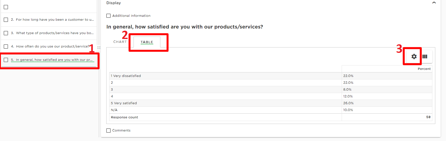
Navigate to Reports and choose the Question(1) you wish to present as a table in the report. Click on Table(2) and then the Gear Button(3) found on the right side.
Select desired Color Scheme from the drop-down menu and the colors will be visible straight away. You may select between several default Color Schemes or create your own from Color Scheme Manager.
Please note: only the Gradient Color Scheme type can be used as Heatmap in tables.
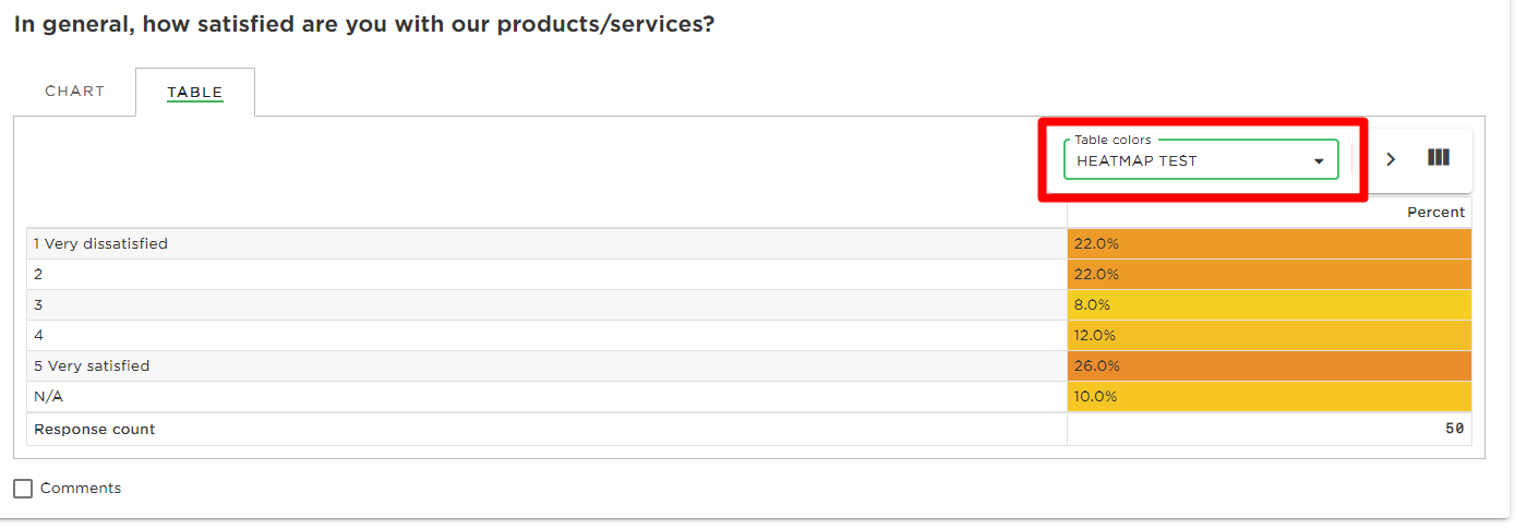
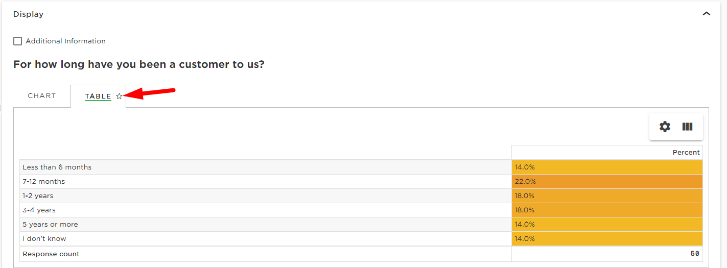
Don’t forget to tick the ‘Star’ next to Table in order to make the Table visible in the Livereport.

Löysitkö vastauksen kysymykseesi? Dokumentaation alla on informatiivisia kuvauksia, jotka auttavat sinua ymmärtämään Essentialin toimintoja ja käyttämään niitä. Palautustyön avulla nostat tietotasoa koko organisaatiossa.