How to use NPS?
Sist oppdatert more than 2 months ago |
Skriv ut
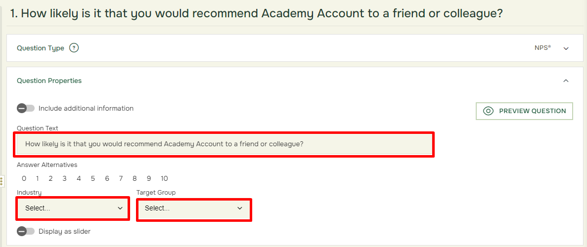
In Designer under Question Properties:
- Possibility to change Question Text to NPS Question, as well as Industry and Target Group. Choose between several industries and Target Groups.
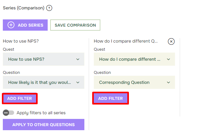
In Reports under Series:
- Possibility to Add Comparison to compare with a Corresponding NPS Question in same or other Quests. The system will automatically compare the NPS with itself when adding a series. You must actively change the question or quest to compare to another. Click Add Series then Add Comparison. Choose which Quest and Question you may want to compare to.
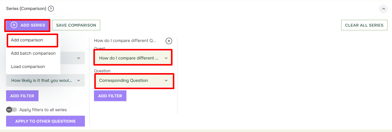
- Possibility to add New Filter, NPS categories are ready to be used straight away. You can also create your own filters.
In Reports under Display:
- Possibility to drag and drop questions in desired order.
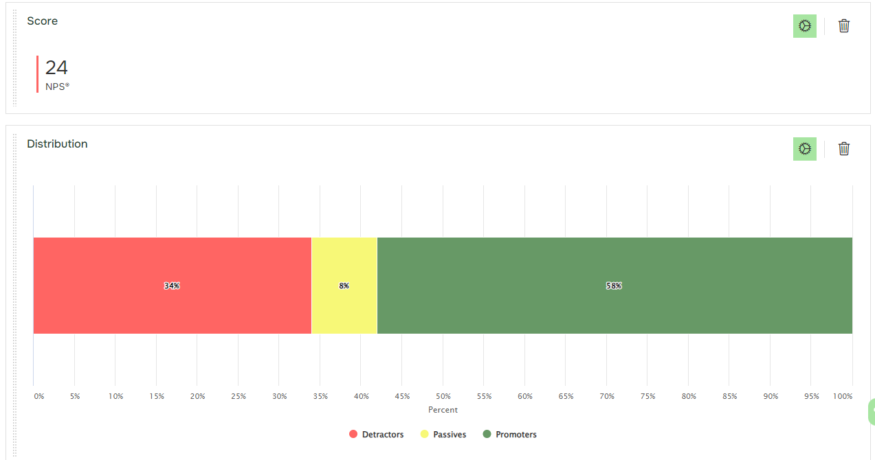
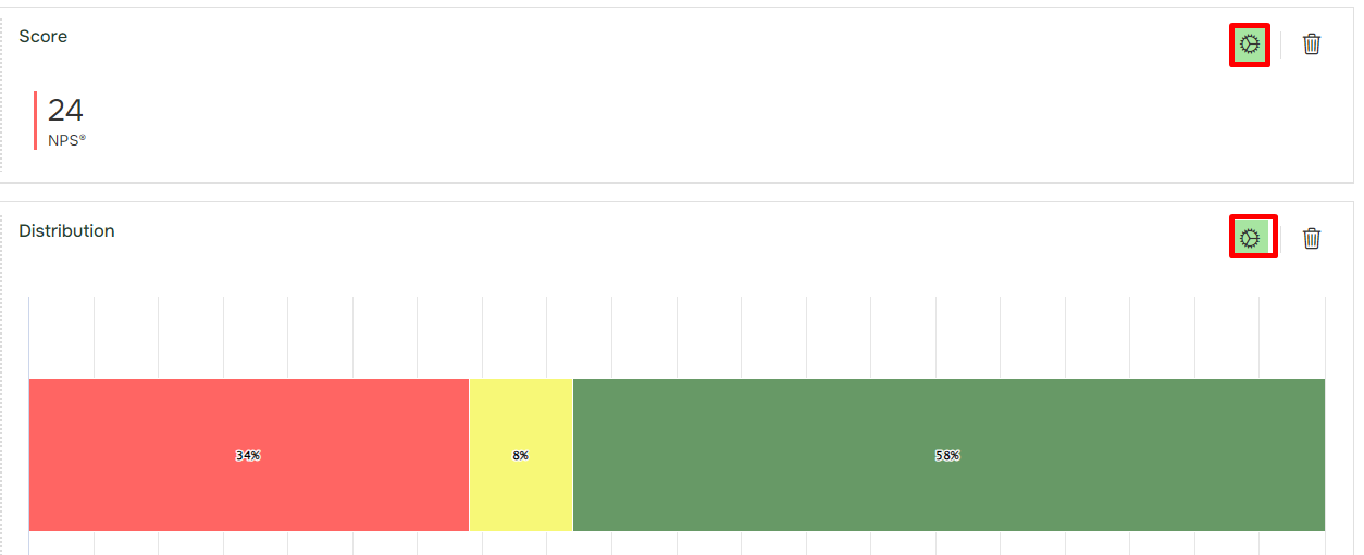
- Possibility to add NPS ITEMS by clicking Add NPS Item button.Score: Shows the score of your NPS question. The Net Promoter Score (NPS) is calculated like this: Promoters minus detractors divided on total responses. It will also contain a chart as default.
You may choose to edit the chart or remove it from the item and only view the score as a value. (Explained further down below).
- View the setting options for the Item by clicking the Gear top right in the item.
For the new Score item there are several settings to choose among:
- Show NPS Value (1), Will give you the NPS score by quantifying the responses and subtracting the percentage of detractors from the percentage of promoters.
- Show chart (2), Will show the chart if selected.
- Aggregate Series (3): This is a setting found under Display settings and shown when using multiple series in your NPS. Aggregate series will combine your used series and give you an average.
- Show Data Labels in Chart (4), Will show the data value directly in Chart if selected.
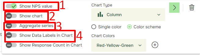
- Show Response Count in Chart , Will show N= based on numbers of respondents that has answered the question.
- Chart Type (5), Choose between several chart types.
- Single color Color/Scheme (6), Choose if chart bars should contain Single Color or a Color Scheme.
- Chart Colors (7), Choose between a range of several Chart colors if you selected a color scheme.
- Delete button (8), Lets you delete the whole item.

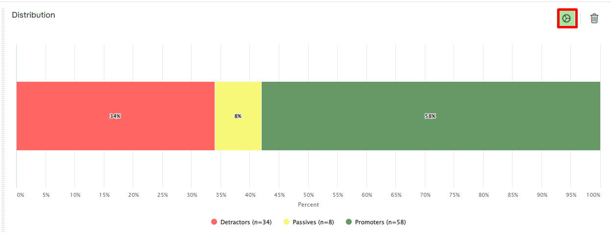
For the new Distribution item there are several settings to choose among:
Distribution: Shows the NPS data as Stacked Bar chart type. You can edit this item as well (Explained further down).
- See the setting options for the Item by clicking the Gear top right in the item.
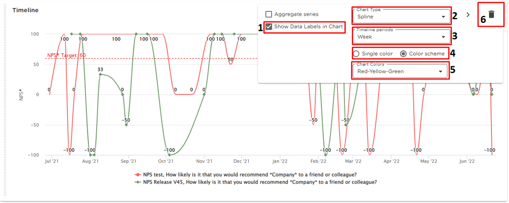
Timeline: Puts the NPS data in a timeline. It is possible to Aggregate series under this item if there are multiple added series. To get a better visualized view as shown previously. Example below is without opting to Aggregate series.
- Show Data Labels in Chart (1), Will show the data value directly in Chart if selected.
- Chart Type (2), Choose between several chart types.
- Timeline periods (3): Choose the Timeline period among several options which will allow you to flexibly define the intervals to be used to display data in timelines (days, weeks, months, etc.).
- Single color/ Color Scheme (4), Choose if chart bars should contain Single Color or Color Scheme.
- Chart Colors (5), Choose between several Chart colors if you selected a color scheme.
- Delete button (6), Lets you delete the whole item.


 For the new Timeline item there are several settings to choose among.